 Owncast 现在支持自定义插件。
自定义颜色与外观
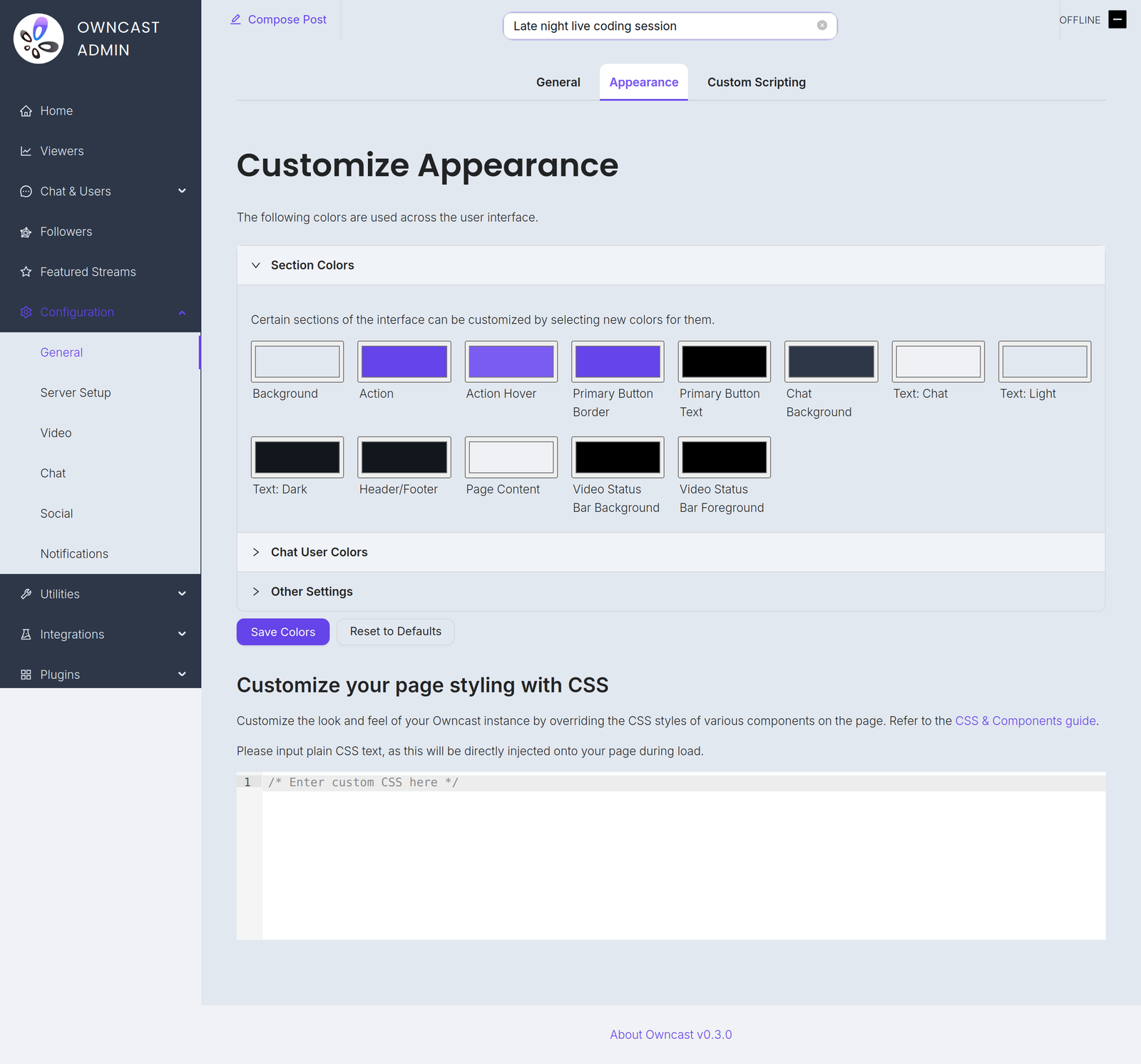
您可以在管理界面的 配置 → 常规 → 外观 中自定义 Owncast 页面颜色和外观。 从各部分的颜色选择器开始,它们无需编写代码。 若需更精细的控制,您可以在编辑器中编写自定义 CSS,下面的 Owncast CSS 辅助工具 会生成一个可粘贴的起始点。
如果您想进一步自定义 CSS,熟悉 CSS 选择器 和 CSS 变量语法 会有帮助,但入门并不依赖这两者。
CSS 选择器
| 选择器 | 描述 |
|---|---|
header | 页面页眉元素 |
footer | 页面页脚元素 |
#global-header-text | 页眉中的文本 |
#offline-banner | 当流离线时显示的横幅 |
#custom-page-content | 页面的自定义内容 |
#notify-button | 用于显示通知模态框的按钮 |
#follow-button | 用于显示关注模态框的按钮 |
#followers-collection | 关注者集合 |
#modal-container | 模态框容器 |
#chat-container | 聊天容器 |
.chat-message_user | 用户发送的聊天消息 |
.chat-message_system | 系统发送的聊天消息 |
.chat-message_social | 来自 Fediverse 的社交消息 |
.followers-follower | 关注者集合中的单个关注者 |
CSS 变量
您可以在管理界面的 CSS 编辑器中手动设置,从而覆盖分配给 CSS 变量的值。 您可以找到可覆盖的 变量名。
例如,如果您想将所有操作项(链接、按钮)设为红色,按钮边框设为绿色,并将页面主体字体更改为 serif 字体,您可以按如下方式设置以下 CSS 变量:
:root {
  --theme-color-action: red;
  --theme-color-components-primary-button-border: green;
  --theme-text-body-font-family: serif;
}
额外的选择器和变量
使用 CSS 时,您可以定位页面上的任何元素,但如果有某些元素您发现难以自定义,请在 Owncast GitHub 仓库 提交 issue,让我们可以考虑添加额外的选择器或 CSS 变量以便更容易定制。 对于常见用例,我们也可能会随着时间在 Owncast 的外观页面中直接添加更多自定义选项。 如果您希望自定义特定内容,欢迎贡献!
外观与主题插件
Theme plugins require Owncast 0.3.0 or later.
插件也可以为观众页面设置样式。 主题插件是安装和共享封装外观的受支持方式。 您在此页面的设置与插件的样式会共同决定最终效果。
您的设置优先。 您在此处选择的颜色和在编辑器中编写的 CSS 会应用在任何插件样式之上,因此当两者都涉及相同颜色时,以您的设置为准。 主题插件充当基线:它会更改您未自行设置的颜色,您显式设置的任何颜色都会覆盖插件的设置。
当插件为您的页面设置样式时,此页面会向您说明:
- 顶部会有一条通知,列出当前正在应用样式的插件。
- 插件设置的每个颜色,其选择器旁都会标注
also set by <plugin>注释。
有两种控制方式:
- 要让主题插件完全控制外观,请使用 重置为默认值 清除您自己的颜色。 如果此处没有设置任何内容,插件的主题会完全显现。
- 要完全停止插件的样式,请在管理员的 插件 页面将其禁用。
Owncast CSS 辅助工具
要通过 CSS 变量自定义 Owncast 的颜色并定制特定元素,请使用下面的 CSS 辅助工具。 此工具旨在为您编写自定义 CSS 提供起步范例,而不是完整解决方案。 使用颜色选择器选择颜色,按需直接编辑 CSS,然后将结果复制并粘贴到 Owncast 管理界面的 配置 → 常规 → 外观.
您可以复制并粘贴自定义 CSS,并作为主题与其他 Owncast 用户分享!
Owncast Components
Select colors to customize your Owncast instance. The CSS will be generated automatically.
--theme-color-action--theme-color-action-hover--theme-color-background-main--theme-color-background-header--theme-color-components-primary-button-background--theme-color-components-primary-button-text--theme-color-components-primary-button-border--theme-color-components-chat-background--theme-color-components-chat-text--theme-color-components-chat-input-background--theme-color-palette-0--theme-color-palette-1--theme-color-palette-2headerThe main header element
footerThe main footer element
#global-header-text#offline-bannerThe banner that appears when the stream is offline
#custom-page-contentThe custom content of the page
#notify-buttonButton to display the notify modal
#follow-buttonButton to display the follow modal
#followers-collection#modal-containerThe container for the modals
#chat-container.chat-message_userA user-sent chat message
.chat-message_systemA system-sent chat message
.chat-message_socialA social message from the Fediverse
.followers-followerA single Follower in the followers collection
Generated CSS
Improve this page
See something missing or incorrect? Edit this page and improve the documentation for everyone.